Welcome to My New Fashion Blog
Visual Merchandising Analysis #9
The first window display with the icy blue is breath taking under the lighting that was used. I love the way the metallics reflect off of the blues. There is a lot of symmetry in this display as well as the center of the display has an object in it and nothing else but the…
Visual Merchandising Analysis #8
I love the concept of both of these displays. I love the way that the neon balances off the wild prints. It feels so retro and so modern all at the same time. I am instantly drawn to the displays. I think both do a good job of creating tension and drawing the eye. I…
VR Blog Post #1
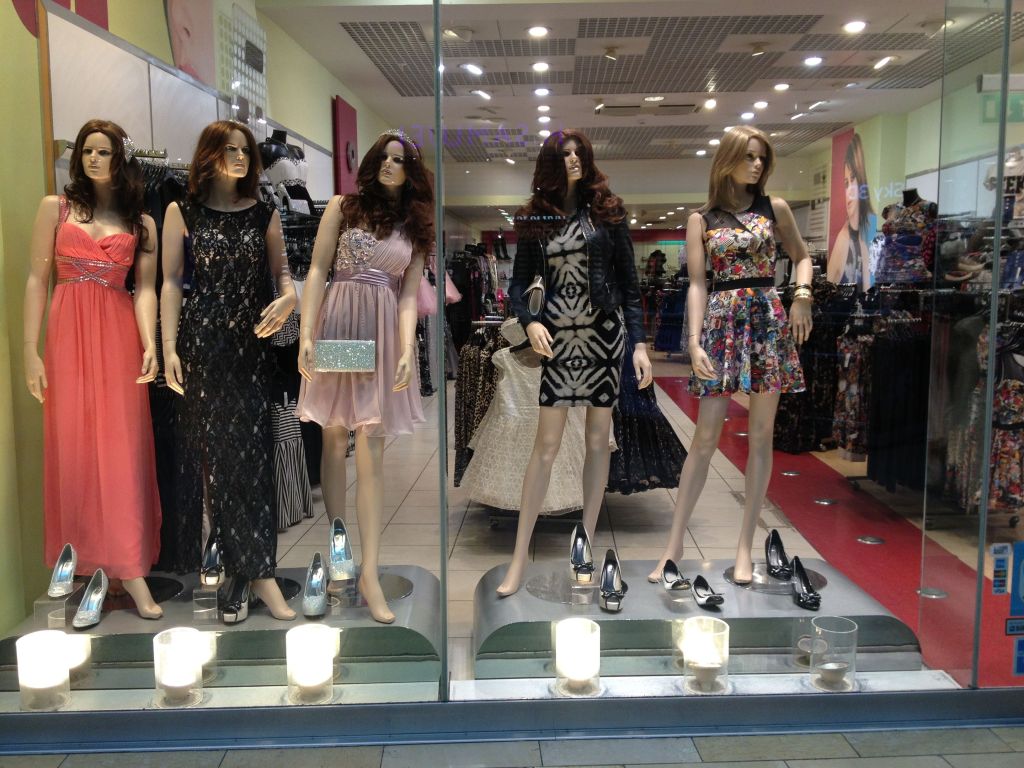
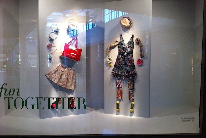
Looking at these two displays I can tell that they were poorly planned and thought very little about. I do not believe that the displays would have helped sell or create desire for their stores. With the first photo there is absolutely no theme or overall direction or unity within the 5 mannequins displayed. The colors of the different outfits and the patterns of the outfits do not go well with each other. On top of that I feel that the mannequins look creepy with the wigs and no faces. I also can tell from the view into the store that the store design is not well established and it is very basic and bright overly contrasting colors. The second photo is horrible because I am unsure of what message they are trying to get across with the display. The way that items being displayed are being shown seem to have no direction. The clothing contrasts each other too much and the message is unclear as stated.
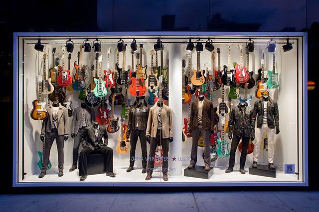
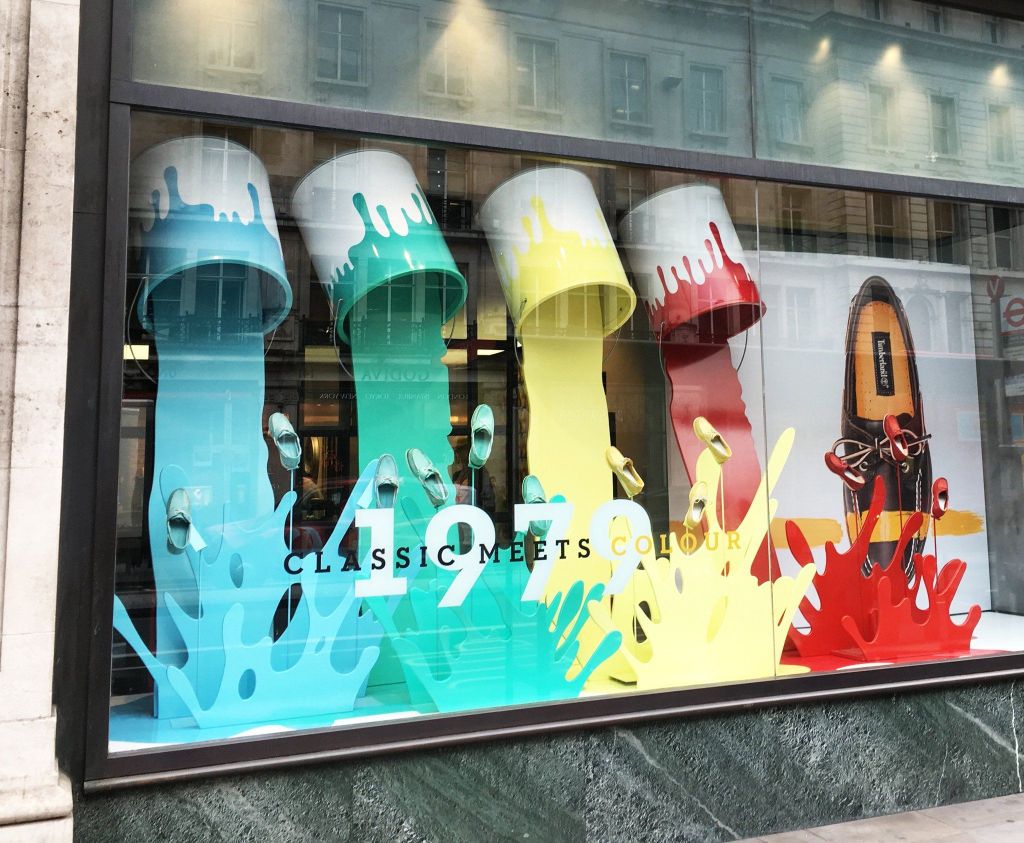
I think the two photos above are extremely well displayed. The first photo with the guitars is interesting because I love the contrast of the suits and color scheme of the suits with the guitars hanging in the background. It displays a very good and clear message. Those who are well-dressed are rockstars. There is a perfect balance of repetition and contrast. I think the other photo is a good display not because the message is clear but because it provokes a question that makes you wonder what the message is supposed to be. You are left wondering what direction the display is supposed to be going.
Follow My Blog
Get new content delivered directly to your inbox.
